

The need for a muse/Du besoin d’une muse
![]() UK :
UK :
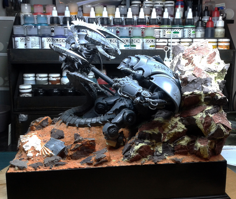
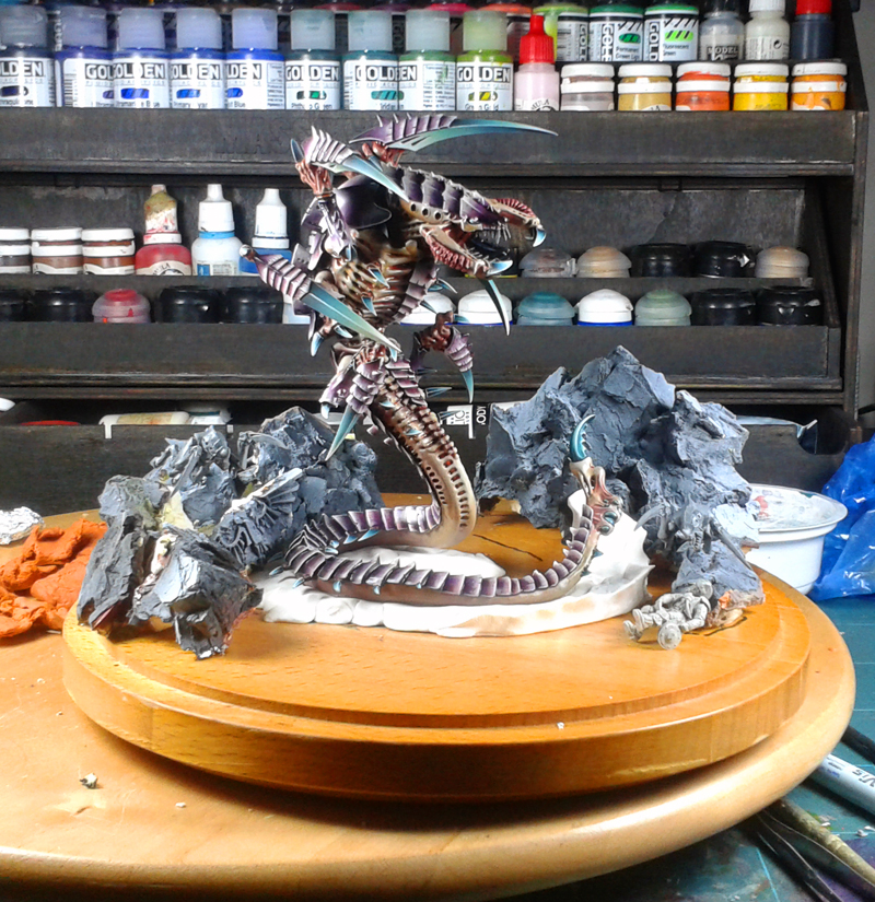
The Greatest Enemy is a diorama I first presented at the English Golden Demon “Enemy of the Imperium”. The most difficult part of this type of competition is to find the theme and the way to represent it. This is the difficulty I will have throughout the construction of this piece. I have never hidden the fact that I am an unconditional fan of Tyranids. Then, since the formula of this GD revolved around a theme, namely that of the “enemies of the Imperium”, the antagonists were quickly found. It’s after that things go bad. Should I paint a single big beast? A big beast with several little tyranids? Just little ones? Or all of that with a character from the ranks of the Imperium? After a while, the idea of making a Trygon again, a miniature that I had already painted, fighting with an Imperial Knight came on the carpet. The principle was to make the Trygon’s tail wrap around the Knight’s leg while overhanging it. The “Titan”, being slumped and crushed against a cliff.
![]() FR :
FR :
The Greatest Enemy est un diorama que j’ai pour la première fois présenté lors du Golden Demon Anglais “Enemis of the Imperium”. Le plus difficile dans ce genre de concours est de trouver le thème et la manière de le représenter. C’est la difficulté que j’aurai durant toute la construction de cette saynète.
Je ne l’ai jamais caché, je suis un fan inconditionnel des tyranides. Alors, vu que la formule de ce GD tournait autour d’un thème, à savoir celui des “ennemis de l’Impérium”, les antagonistes ont été rapidement trouvés.
C’est ensuite que les choses se gâtent. Devais-je peindre une seule grosse bête ? Une grosse bête avec plusieurs petits tyranides ? Juste des petits ? Ou le tout avec un personnage venant des rangs de l’Imperium ?
Au bout d’un certain moment, l’idée de représenter un Trygon, figurine que j’avais déjà peinte, se battant avec un Chevalier Impérial est venue sur le tapis.
Le principe était de faire s’enrouler la queue du Trygon autour de la jambe du Chevalier tout en le surplombant. Le “Titan”, lui étant affalé et écrasé contre une falaise.
![]() UK :
UK :
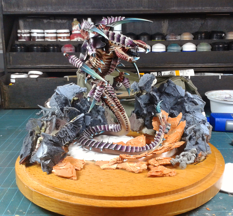
But the further the work went, the less the idea pleased me. Even if the general impression gave off a certain power, it was lacking in dynamism. Especially since the general composition became the exact copy of an old diorama “War for Macragge – Until the End“. The trygon on the left, the imperial camp on the right, a large piece of rock closing the scene in the right part, the same sense of reading, etc. So, it was wrong. Even if the diorama worked, there were too many things to take pleasure in this project. But there was not much time left. The idea of going to this event was realized late, and the redesign of the diorama was undertaken at three weeks of the day J. Three weeks and about 200 estimated hours of work, the nights would be short.
![]() FR :
FR :
Mais plus le travail avançait moins l’idée m’emballait. Même si l’impression générale dégageait une certaine puissance, il manquait à mon sens du dynanisme. D’autant plus que la composition générale devenait l’exact copie d’un ancien diorama “War for Macragge – Until the End“. Le trygon sur la gauche, le camp impérial sur la droite, un gros élément de décor fermant la scène dans la partie droite, le même sens de lecture, etc. Donc, ça n’allait pas. Même si le diorama fonctionnait, il y avait trop de redîtes pour prendre du plaisir sur ce projet.
Or, il ne restait plus beaucoup de temps. L’idée de se rendre à cet événement s’étant réalisée tardivement, et la refonte du diorama ayant été entreprise à trois semaines du jour J.
Trois semaines et environ 200 heures de travail estimées, les nuits allaient être courtes.
Let’s Start/C’est Parti.
![]() UK :
UK :
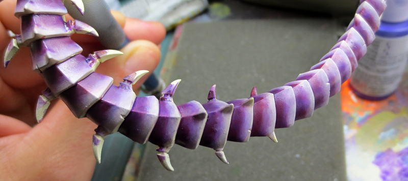
Here, and in order to get back on my feet, I began by painting Trygon’s chitin. I had to paint it in several pieces because too many areas became difficult to access once mounted. But I’ll come back to it a little later. I first undercoat it with a white bomb.
Then, with the airbrush, I put a mixture of Naples Yellow (Lefranc Bourgeois) and Titan Buff (Golden). After that, Ultramarine Violet (Golden) and Titan Buff are graded to obtain the intermediate tone. In order to see where I was going, I then began shadowing.
I start by taking my Ultramarine Violet, but this time pure. I add a few small touches of black thereafter. Finally, I spend very diluted wash of black ink in order to finalize them. Regarding lights, I simply add Ivory (Prince August) to the Titan Buff. The mixture is about 50/50.
![]() FR :
FR :
Ici, et afin de me remettre en jambe j’ai commencé par la peinture de la chitine du Trygon.
J’ai du le peindre en plusieurs morceaux car trop de zones devenaient difficiles d’accès une fois monté. Mais j’y reviens un peu plus tard.
Je l’ai d’abord sous-couché en blanc à la bombe. Puis, à l’aérographe, j’ai posé un mélange de Jaune de Naples (Lefranc Bourgeois) et de Titan Buff (Golden).
S’ensuit la pose de dégradés d’Ultramarine Violet (Golden) et de Titan Buff pour obtenir le ton intermédiaire.
Afin de voir où j’allais, j’ai ensuite entamé la constuction des ombres. Je commence par reprendre mon Ultramarine Violet, mais cette fois-ci pur. J’y ajoute quelques petites touches de noir par la suite. Enfin, je passe des lavis très dilués d’encre de chine noire afin de les finaliser.
Concernant les lumières, j’ajoute simplement de l’Ivoire (Pa) au Titan Buff. Le mélange est à peu près 50/50.
![]() UK :
UK :
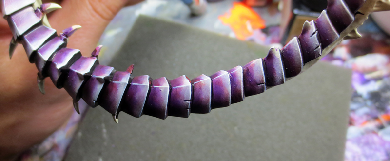
We refine. I push my lights with the previous mix in which I increase the part of Ivory. I refine transitions and especially I add inks. In the first place an ink answering the sweet name of Dioxazyne Purple. Bless you ! My violets are thus gaining depth. Then, in order to warm my hue, I pass red ink filters + brown ink (ratio 50/50). I finalize with very diluted Pyrrole Orange (Golden) juices in the lights. In order to gain readability and definition, I separate all the chitin plates with a mixture of black ink and violet ink. I pass pure ivory on the edges of the plates.
![]() FR :
FR :
On peaufine. Je pousse mes lumières avec le précédent mélange dans lequel j’augmente la part d’Ivoire. J’affine les transitions et surtout j’ajoute des encres. En premier lieu une encre répondant au doux nom de Dioxazyne Purple. À vos souhaits ! Mes violets gagnent ainsi en profondeur. Puis, afin de réchauffer ma teinte, je passe des filtres d’encre rouge + encre marron (ratio 50/50). Je finalise avec des jus très dilués de Pyrrole Orange (Golden) dans les lumières.
Afin de gagner en lisibilité et définition, je sépare toutes les plaques de chitines par un mélange d’encre de chine noire et d’encre violette. Je passe de l’Ivoire pur sur les arêtes des plaques.
![]() UK :
UK :
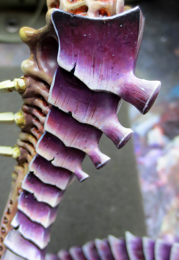
We move to the texture. With a brush with a very fine tip and a good tank (like a size 1 from Kolinsky) I realize features composed of Pyrrole Orange and black. They should never have the same length side by side or the same spacing. We must alternate. It’s also a question of visual feeling. This kind of streaked textures do not like regularity or monotony. I repeat the same operation with pure ivory strokes.
Then, with a brush loaded with paint, I make projections to get chitin’s “tasks”. I take the same mixes as before.
I finish with varnish gradients to get the clean rendering of insect shells. I start with satin varnish (PA) by placing it a little higher than the middle and pulling it towards the shadows. Then, I go to High Gloss Varnish (Liquitex). I push it in the same direction but starting at about the last third of the plates. If ever the transitions between the varnishes are not perfect I mix them at an equivalent ratio and I come to realize the missing transition.
![]() FR :
FR :
On passe à la texture. Avec un pinceau disposant d’une pointe très fine et d’un bon réservoir (comme un taille 1 de chez Kolinsky) je réalise des traits composés de Pyrrole Orange et de noir. Ils ne doivent jamais avoir la même longueur côte à côte ni le même espacement. Il faut alterner. C’est aussi une question de ressenti visuel. Ce genre de textures striées n’aime pas la régularité ou la monotonie.
Je réitère la même opération avec des traits d’Ivoire pur. Puis, avec un pinceau chargé de peinture, je réalise des projections afin d’obtenir des “tâches” sur ma chitine. Je reprends les mêmes mélanges que précédemment.
Je termine par des dégradés de vernis pour obtenir le rendu propre aux carapaces d’insectes.
Je commence avec du vernis satiné (PA) en posant celui-ci un peu plus haut que le milieu et en le tirant vers les ombres. Puis, je passe au Vernis Ultrabrillant (Liquitex). Je pousse ce dernier dans la même direction mais en partant à peu près du dernier tiers des plaques. Si jamais les transitions entre les vernis ne sont pas parfaites je les mélange à un ratio équivalent et je viens réaliser la transition manquante.
Of the importance of multi-part/De l’importance de peindre en kit.
![]() UK :
UK :
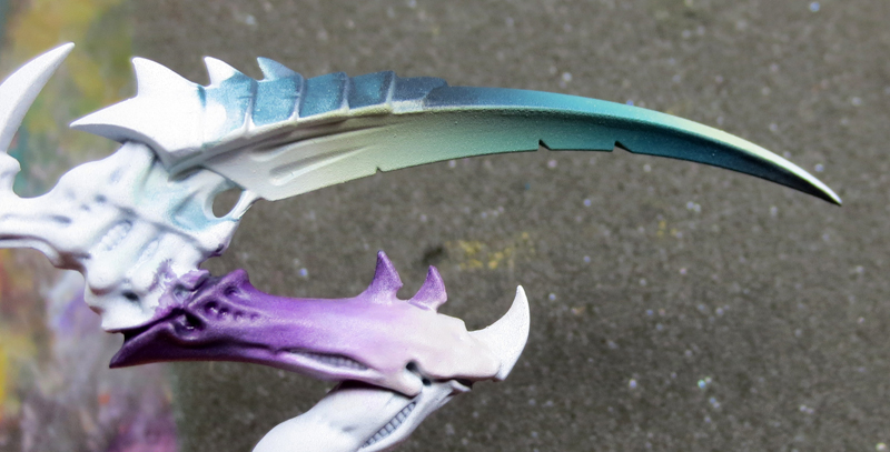
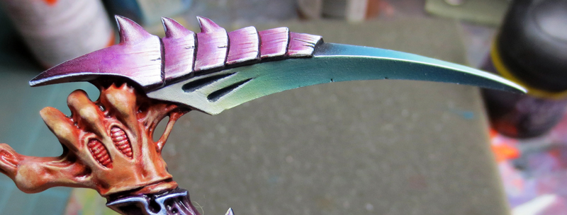
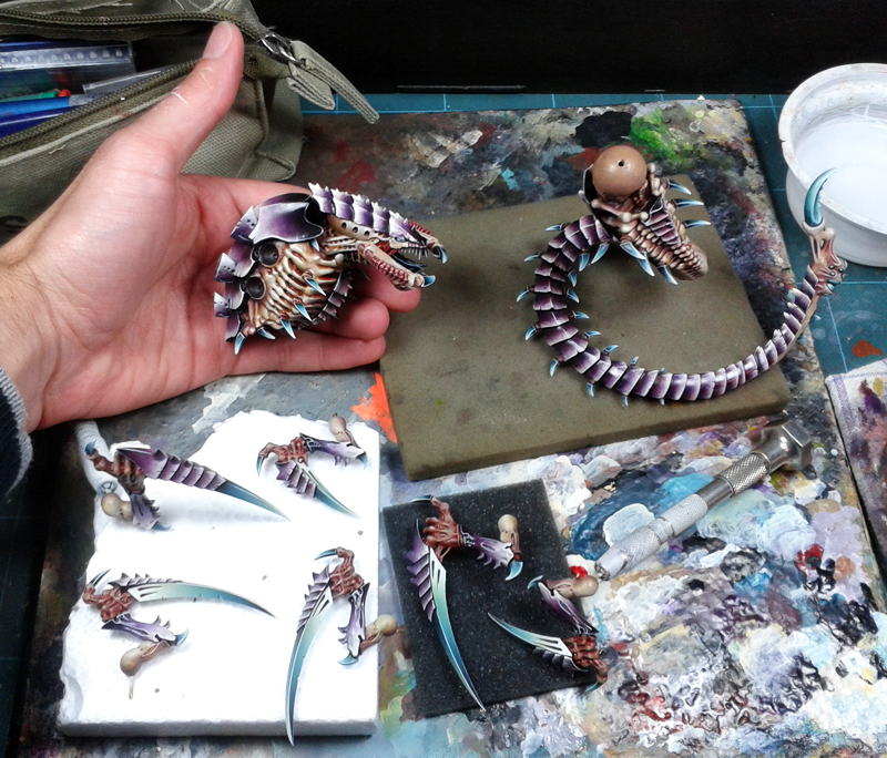
As mentioned above, I had to painted most of the miniatures in parts. Two obvious reasons: for accessibility, but also for consistency. In fact, from the moment you perfectly master the color scheme and you say that you do not remain in the repercussion part to another without variation, the fact of being able to juxtapose two pieces makes it possible to check the management of the light . Similarly, during the painting of the arms, blades having been made with an airbrush, this allows a laying of bases “at the chain” and therefore with the same mixtures. For the “blades” of the arms, so I used my airbrush. These blades, in particular, are very large and light, and they are represented not only by a saving of time, but also by the certainty of obtaining a constant gradient, without apparent transitions. The rest of the arm is protected with clingfilm so as not to color it.
I then start the foundations. On the white undercoat, I put the colors according to the principle of metalic opposition. Not to get a metallic effect but to get hot/cold color contrasts allowing me to define them well. For the turquoise blue, I put filters of Coblat Turquoise (golden) and white (50/50). I darken this shade by using pure turquoise blue, to which I add black, then I push to pure black. For the lights, I use a filter of Blue Turquoise + Naples Yellow (LB) + white. I get a median green/turquoise. I finally increase the proportion of yellow in a last pass. Above all I let the opposite ends to black retain the white of the underlayer.
![]() FR :
FR :
Comme dit un peu plus haut, j’ai du me résoudre à peindre ce kit en pièces détachées. Deux raisons évidentes : pour l’accessibilité, mais aussi par cohérence. En effet, à partir du moment où l’on maîtrise parfaitement son schéma de couleur et que l’on sait que l’on a pas de mal à le répercuter d’une partie à l’autre sans variation de tons, le fait de pouvoir juxtaposer deux pièces permet de vérifier aisément la gestion de la lumière. De même, lors de la peinture des bras, les lames ayant été réalisées à l’aérographe, cela a permis une pose des bases “à la chaîne” et donc avec les mêmes mélanges. Pour les “lames” des bras, j’ai donc utilisé mon aérographe. Ces lames étant particulièrement grandes, et le temps commençant à défiler, cela représentait non seulement un gain de temps mais aussi la certitude d’obtenir un dégradé constant, sans transitions apparentes. Le reste du bras (main, avant-bras, épaule etc) est protégé avec un film alimentaire afin de ne pas le colorer.
Je pose ensuite les bases. Sur la sous-couche blanche je pose les couleurs selon le principe d’opposition du métal. Non pas pour obtenir un effet métallisé mais afin d’obtenir des contrastes de couleurs chaudes/froides me permettant de bien les définir. Pour le bleu turquoise, je pose des filtres de Cobalt Turquoise (Golden) et de blanc (50/50). Je fonce cette teinte en usant de bleu turquoise pur, auquel j’adjoint du noir, puis je pousse au noir pur. Pour les lumières, je passe un léger filtre de bleu turquoise + Jaune de Naples (LB) + blanc. J’obtiens ainsi un vert turquoise médian. J’augmente enfin la proportion de jaune dans un dernier passage. Surtout je laisse les extrémités opposées au noir conserver le blanc de la sous-couche.
![]() UK :
UK :
Once this graduation done with the airbrush, I pass to finishes. I use again the brushes in some places where small drops of paints could be projected by airbrush and especially I push the upper zone to turquoise green by adding pure Naples Yellow filters. I finish my blade with Naples Yellow and Ivory filters. Then with pure Ivory I realize the edges. Finally, with a mixture of turquoise ink and black I come to darken the two “hollow” at the top of the blades that I emphasize with Ivory too. I especially try to keep a rendering between satin and matte to stand out with the areas of adjacent chitin that are rather bright. This also leads to the readability of the piece.
![]() FR :
FR :
Une fois ce dégradé réalisé à à l’aérographe, je passe aux finitions. Je repasse au pinceau à certains endroits où des petites gouttes de peintures ont pu être projetées via l’outil et surtout je pousse la zone supérieure au vert turquoise en ajoutant des filtres de Jaunes de Naples purs. Je finis ma lame par des filtres de Jaunes de Naples et d’Ivoire. Puis avec de l’Ivoire pur je réalise les arêtes.
Enfin, avec un mélange d’encre turquoise et de noir je viens foncer les deux “creux” en haut des lames que je souligne avec de l’Ivoire là aussi. Je cherche surtout à conserver un rendu entre le satiné et le mat afin de trancher avec les zones de chitines adjacentes qui sont plutôt brillantes. Cela conduit aussi à la lisibilité de la pièce.
![]() UK :
UK :
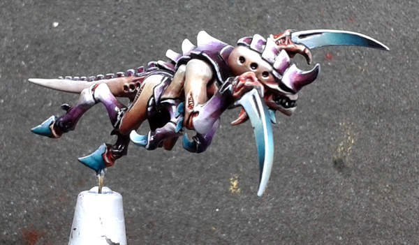
The same processes for the painting of chitin and blades are repeated on each of the gaunts.
![]() FR :
FR :
Les mêmes procédés pour la peinture de la chitine et des lames sont repris sur chacun des gaunts.
![]() UK :
UK :
Painting the trygon in spare parts really allowed me to obtain a greater serenity in its painting. Given the number of small claws, it would have been particularly difficult to achieve smooth and clean gradients if it had been necessary to juggle the position of the brush to pass between each of them.
![]() FR :
FR :
Peindre le trygon en pièces détachées m’a réellement permis d’obtenir une plus grande sérénité dans sa peinture. Vu le nombre de petites griffes, il aurait été particulièrement ardu de réaliser des dégradés et fondus propres et d’un seul tenant s’il avait fallu jongler avec la position du pinceau afin de passer entre chacune d’elles.
To the scenery/On passe au décor.
![]() UK :
UK :
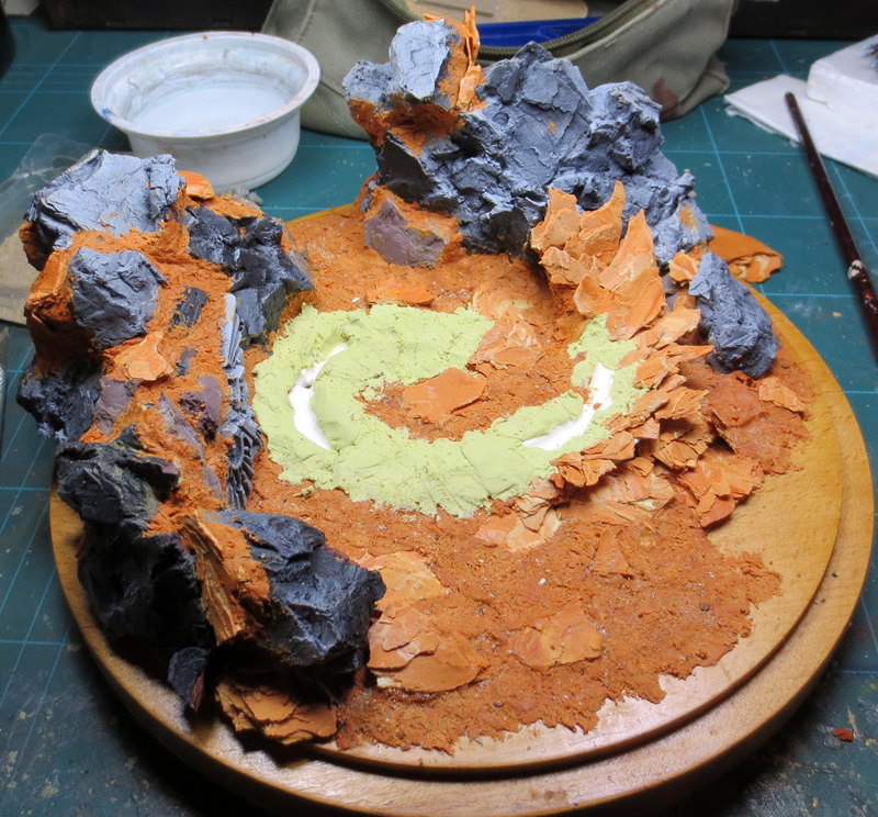
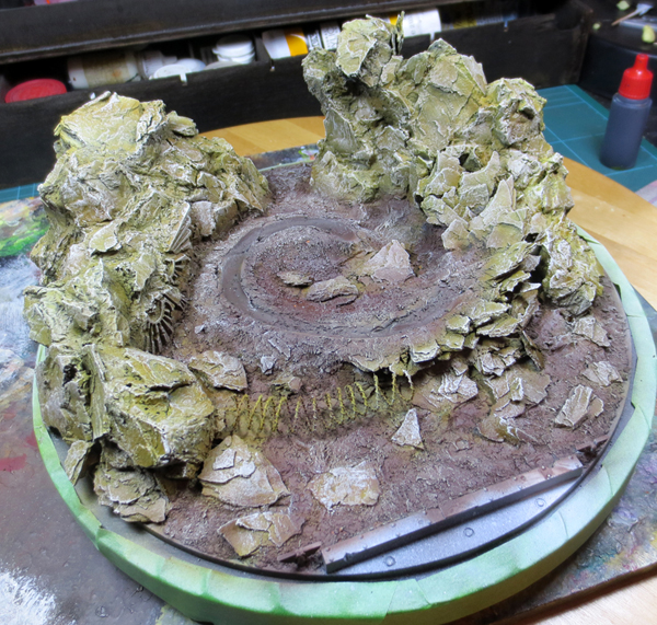
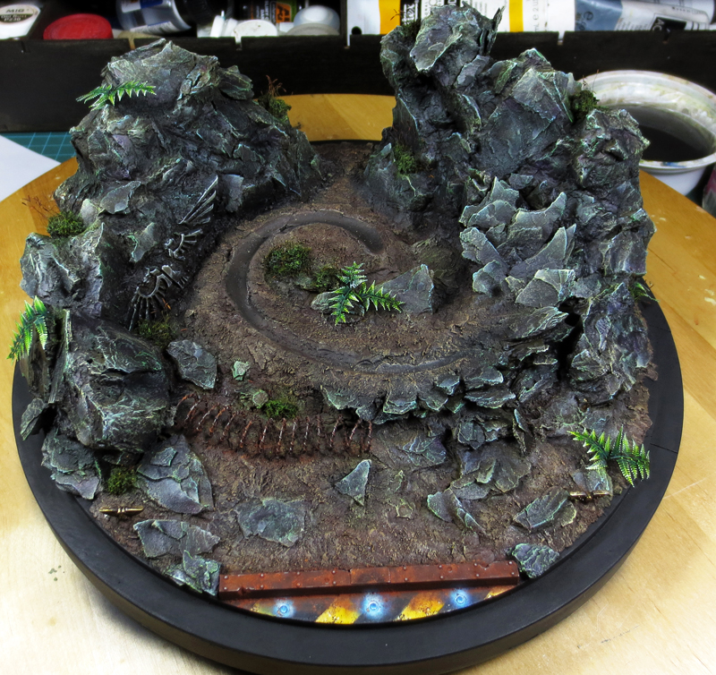
Time goes by and the delay never catches up. The deadline is getting closer and having revised the project to zero, I had to redo a scenery. The new composition had to go against the first project. From a rectangular base, imposing a fixed front view, I decided for a round base. Or, finding a round base of almost 20cm diameter is not something that easy… Except when we have (a lot) of luck. A road trip into the family, an old cheese tray that was no longer used, and here I am with my base ! Nothing is lost, everything is transformed !
I start by marking the footprint of the Trygon with some Fimo. This time I position it in the center so that it becomes the main element. Then, in order to gain in efficiency, I re-used the rock of the first base. The soil is made with Milliput. Once the Milliput is filed, I sprinkle over a mixture of different sands. Very fine, medium, small gravel, it takes variety. I dab it all with blister foam to push it into the Milliput and let it rest for about fifteen minutes. Since then, with a silicone sculpting tool I just stretch the paste to “break”. I get a nice texture. As long as the Milliput has not completely hardened, I also push small pieces of rock here and there. Not only for a realism but also to break the monotony.
![]() FR :
FR :
Le temps défile et le retard ne se rattrape jamais. La deadline se rapproche et ayant revu le projet à zéro, il me fallait donc refaire un décor. La nouvelle composition se devait d’aller à l’encontre du premier projet. D’un socle rectangulaire, imposant une vue de face fixe, je me décidais pour un socle rond. Or, trouver un socle rond de près de 20cm de diamètre ça ne se déniche pas non plus dans l’heure… Sauf quand on a (beaucoup) de chance.
Un aller-retour dans la famille, un vieux plateau de découpe à fromage (type Tête de Moine) qui ne servait plus, et me voilà avec mon socle ! Rien ne se perd, tout se transforme.
Je commence par marquer l’empreinte du Trygon avec de la pâte Fimo. Cette fois je le positionne au centre afin qu’il devienne l’élément principal. Puis, afin de gagner en efficacité, j’ai réutilisé la roche du premier décor.
Le sol est réalisé avec du Milliput. Une fois la pâte déposée, je saupoudre par dessus un mélange de différents sables. Du très fin, du moyen, des petits graviers, il faut de la variété. Je tamponne le tout avec de la mousse de blister pour l’enfoncer dans la pâte puis je la laisse reposer une quinzaine de minutes. Dés lors, avec un pinceau gomme je viens étirer la pâte pour la “briser”. J’obtiens ainsi une jolie texture. Tant que la pâte n’a pas complètement durcie j’enfonce aussi de petits morceaux de roche par-ci par-là. Non seulement pour une question de réalisme mais aussi pour casser la monotonie.
![]() UK :
UK :
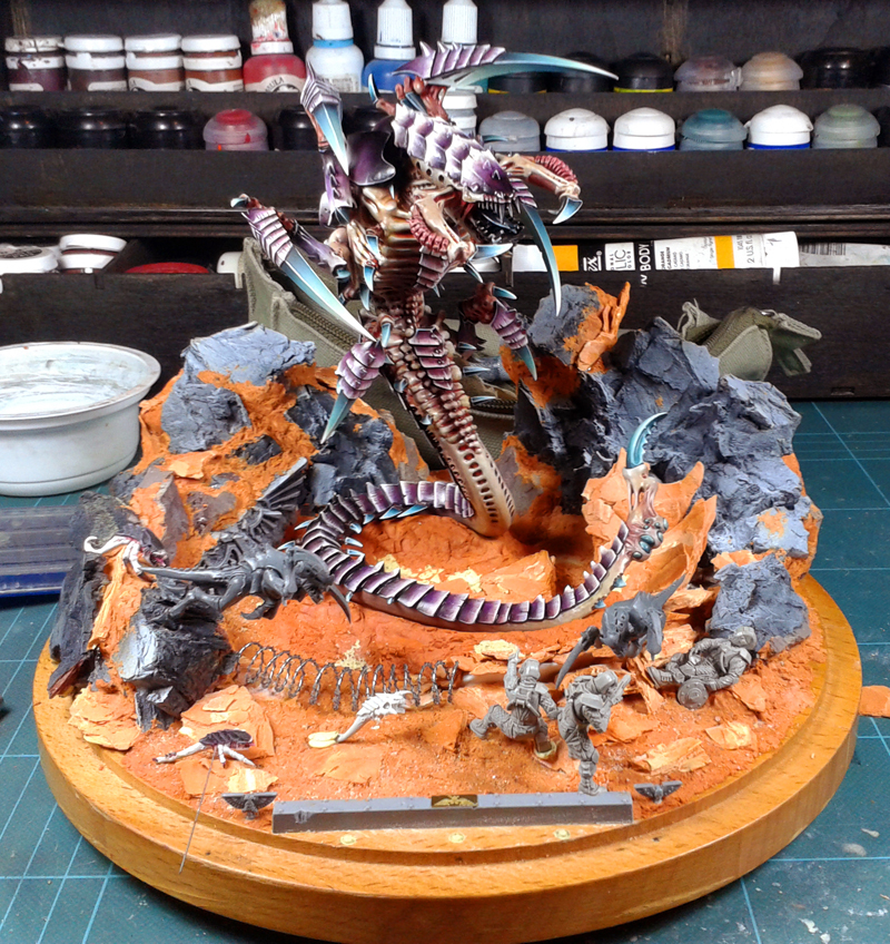
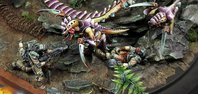
Once the textures are complete, I test the different combinations of character locations. For this diorama, I wanted dynamism. The round base, the centered trygon, the rock surrounding it, I had built everything to allow the Hormagaunts to “jump” over the rock to give a feeling of speed. The three Elysian, one seriously wounded, were deliberately restricted to the front of the base and placed back facing the viewer. With the bar on the front and with the paint I was reserving for this place, it was going to become easily understandable that the tyranids were hovering over an area : an imperial base. The place where the spectator is, withdrawn from the stage being thus this zone “out of framework”. The Elyos are the first bulwark, the one who makes the first wave … but who will not get by.
![]() FR :
FR :
Une fois les textures achevées, il convient de tester les différentes combinaisons d’emplacements des personnages. Pour ce diorama, je voulais du dynamisme. Le socle rond, le trygon centré, la roche l’entourant, j’avais tout construit afin de permettre aux Hormagaunts de “bondir” par dessus la roche afin de donner une sensation de vitesse.
Les trois Elyséens, dont un gravement blessé, ont été volontairement restreints au devant de la scène et placés de dos.
Avec la barre installée sur le devant et avec la peinture que je me réservais pour cet endroit, il allait devenir facilement compréhensible que les tyranides foncent sur une zone, comme une base impériale. L’endroit où se trouve le spectateur, en retrait de la scène étant donc cette zone “hors cadre”.
Les Elyséens sont le première rempart, celui qui fait fasse à la première vague… mais qui ne va pas s’en sortir pour autant.
Drybrushing is life/Le brossage c’est la vie.
![]() UK :
UK :
To paint a base of this size, even for a contest, there are not 70 techniques. Drybrushing is the most consistent way to get the necessary contrasts. For rock I go on a brown/green as the basic tone. For the soil, I go on a brown/reddish. I brush all of my base with Titan Buff.
![]() FR :
FR :
Pour peindre un socle de cette dimension, même pour du concours, il n’y a pas 70 techniques. Le brossage à sec reste le moyen le plus cohérent pour obtenir les contrastes nécessaires.
Pour la roche je pars sur un brun/vert comme ton de base. Pour le sol, je pars sur un marron/rougeâtre. Je brosse l’intégralité de mon socle avec du Titan Buff.
![]() UK :
UK :
Then with purple inks, and mediums such as Leviathan Purple (GW) I just start to darken the rock. I take care to keep the base by transparency in the lights so that the work concerning them remains easy. Indeed, by darkening all the rock, to realize lights becomes harder. Making light on dark is always longer. For the edges I start to pose small drybrushing and small touches of colors. These are composed of emerald green and light turquoise blue. I answer thus in the rock in the blue/turquoise tones of the blades of my tyranids. When we look for coherence on a diorama everything is always question of color recall. Always.
![]() FR :
FR :
Puis avec des encres violettes, et des médium tels que du Léviathan Purple (GW) je viens commencer à foncer la roche. Je prends garde à conserver la base par transparence dans les lumières pour que le travail les concernant reste aisé. En effet, en fonçant toute la roche, réaliser des lumières devient plus laborieux. Faire du clair sur du sombre est toujours plus long.
Pour les arêtes je commence à poser de petits brossages et des petites touches de couleurs. Celles-ci sont composées de vert émeraude et de bleu turquoise clair. Je réponds ainsi dans la roche aux tons bleus/turquoises des lames de mes tyranides. Quand on cherche la cohérence sur un diorama tout est toujours question de rappel des couleurs. Toujours.
![]() UK :
UK :
I then increase the contrasts. I deepen the shadows with purer violins, more opaque and mixed with tips of black. For lights, I just make thinning with a mixture of Ivory and Naples Yellow using the method of successive washings. I end with small points of light with the same mixture.
![]() FR :
FR :
Je pousse ensuite les contrastes. J’approfondis les ombres avec des violets plus soutenus, plus opaques et mélangés avec des pointes de noir. Pour les lumières, je viens réaliser des éclaircis avec un mélange d’Ivoire et de Jaune de Naples en utilisant la méthode des lavis successifs. Je termine par des petits points de lumières avec le même mélange.

Do not forget the details/Ne pas oublier les détails
![]() UK :
UK :
The same attention must be paid to the base and scenery as to the miniatures themselves. Here, the theme is: “Enemies of the Imperium”. I had to represent the Imperium in one way or another.
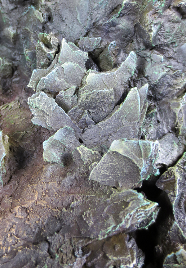
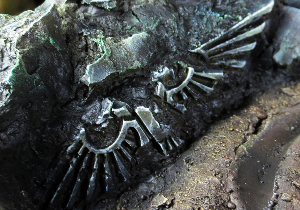
With old resin plaster prints of imperial eagles I drew in my bitzbox to incorporate one. The initial goal is to symbolize an engraving in the rock near the base meaning simply: imperial territory. The eagle being damaged (erosion, time passing, etc.), I did not paint it in a smooth way. By taking again the colors of the rock I accentuated here and there some scratches, breaks, edges …
![]() FR :
FR :
Il faut apporter la même attention aux socles et aux décors qu’aux figurines elles-mêmes. Ici, le thème est : “Ennemis de l’Impérium”. Je me devais donc de représenter l’Impérium d’une manière ou d’une autre.
Disposant d’anciens tirages en plâtre résine d’aigles impériaux j’ai pioché dans ma boite à rabiots pour en incorporer un. Le but initial étant de symboliser une gravure dans la roche proche de la base signifiant simplement : territoire impérial. L’aigle étant abîmé (érosion, temps qui passe, etc), je ne l’ai surtout pas peint de manière lisse. En reprenant les teintes de la roche j’ai accentué ici et là certaines éraflures, cassures, arêtes…
![]() UK :
UK :
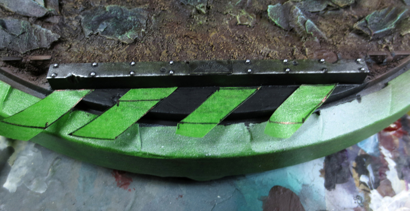
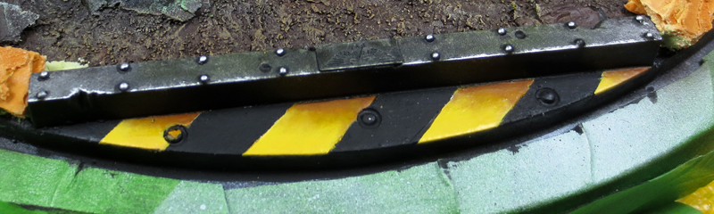
For the front of the base, there is a graphic code that works very well: alternating yellow and black industrial paint strips. Their achievements being necessarily linked to a human activity I gain a narrative aspect: “there is a place beyond these bands“. To achieve them, nothing is very complicated. Start by measuring the length to be painted and calculate the desired width of each segment. Once the ratio is established, it is sufficient to cut a defined number of masking tape, put them on a surface previously painted black and remove one out of two.
![]() FR :
FR :
Pour le devant de la base, il y a un code graphique qui fonctionne très bien : les bandes de peinture industrielle jaunes et noires alternées. Leurs réalisations étant forcément liées à une activité humaine j’y gagne un aspect narratif : “il y a un lieu au delà de ces bandes“.
Pour les réaliser, rien de très compliqué. Commencez par mesurer la longueur à peindre et calculez la largeur souhaitée de chaque segment. Une fois le ratio établi, il suffit de découper un nombre X de bandes en scotch de masquage, de les poser sur une surface préalablement peinte en noire et d’en enlever une sur deux.
![]() UK :
UK :
Unmasked areas are painted white and then yellow. I darken the yellow stripes with an orange-brown. I enlighted them with the basic yellow to which I add white.
![]() FR :
FR :
Les zones non masquées sont repeintes en blanc, puis en jaune. Je viens dégrader les bandes jaunes avec un marron orangée. Je les éclaircis avec le jaune de base auquel j’ajoute du blanc.
![]() UK :
UK :
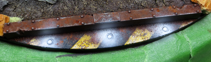
After depositing and fixing pigments to make rust, I take again the airbrush. Indeed, always to simulate the entrance of a base, I had previously carved some kinds of “diodes” embedded in the ground. To make a secondary light effect (OSL), the airbrush is a valuable tool. I start spraying white to define the halos.
![]() FR :
FR :
Je continue le travail. Après avoir déposé et fixé des pigments pour réaliser de la rouille, je ressors l’aérographe. En effet, toujours afin de simuler l’entrée d’une base, j’avais préalablement sculpté des sortes de “diodes” incrustées dans le sol. Pour rendre un effet de lumière secondaire (OSL), l’aérographe est un outil précieux. Je commence par pulvériser du blanc pur pour définir les halos.
![]() UK :
UK :
Then, I spray turquoise blue, then the closer I get to the center, the more I go to almost pure white. The most complicated in this kind of elements, especially if they are in the foreground, is not to make a too powerful halol. Indeed, we get a direct focus on these details, which attracts the eye. You have to know how to keep the balance to have a nice little effect that catches the eye but does not divert attention from the general scene.
![]() FR :
FR :
Je pulvérise ensuite du bleu turquoise, puis plus je me rapproche du centre, plus je vais au blanc quasi pur. Le plus compliqué dans ce genre d’éléments, surtout s’ils sont au premier plan, est de ne pas réaliser un halo trop grand ou puissant. En effet, on obtient alors une focale directe sur ces détails, ce qui attire le regard. Il faut savoir garder l’équilibre pour avoir un petit effet sympa qui attire l’œil mais qui ne détourne pas l’attention de la scène générale.

![]() UK :
UK :
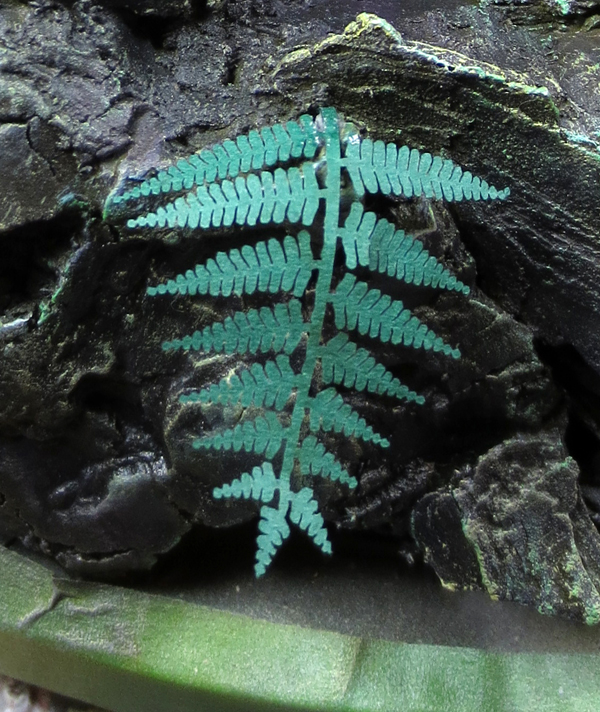
It’s time to make the vegetation. In order to stay on a slightly borrowed wild look, I thought that it would finally be an opportunity to use ferns that I had in stock. These paper sheets produced by laser cutting come from the Green Line brand (available on the Fredericus-Rex website E-Shop). There is a variety of them: ivy, ferns, dandelions, squash leaves, and so on. The list is really long. These leaves offer two notable benefits. They are easy to use, we take tweezers, we remove them from the general sheet, we place them with a dot of glue. Completed. In addition, with their green color, it is not necessary to uncoat them before working. The color of the paper can be used directly as the base color, which is then worked in shadow and light. On the other hand, since it is paper, everything remains “fragile”.
![]() FR :
FR :
Place ensuite à la végétation. Afin de rester sur un thème légèrement emprunt d’aspect sauvage, je me suis dit que ce serait enfin l’occasion d’utiliser des fougères que j’avais en stock.
Ces feuilles en papier produites par découpe laser proviennent de la marque Green Line (en vente sur l’E-Shop du site Fredericus-Rex). Il en existe toute une variété : du lierre, des fougères, des pissenlits, des feuilles de courges, etc. La liste est vraiment longue.
Ces feuilles offrent deux avantages notables. Elles sont faciles d’utilisation, on prend une pince à épiler, on les enlève de la feuille générale, on les place avec un point de colle. Terminé. De plus, de couleur verte, on est pas obligé de les sous-coucher avant de les travailler. On peut directement se servir de la teinte du papier comme couleur de base que l’on vient ensuite travailler en ombre et en lumière. En revanche, étant donné qu’il s’agit de papier et à l’échelle, le tout reste “fragile”.
![]() UK :
UK :
For the ferns painting I used the paper color as the color base. With a green (Chromium Oxide Green, Golden) and black, I first started by painting the underside of the plants. Then using my basic green and a tip of turquoise ink, I started shading the leaves. I use a dark turquoise for this. Why ? It’s simple. The monsters have turquoise on them, so I continue to use this color in other places. It remains subtle, but functional. In addition, I gain a satin/shiny appearance in the shadows and intermediaries which contrasts with the mat ground.
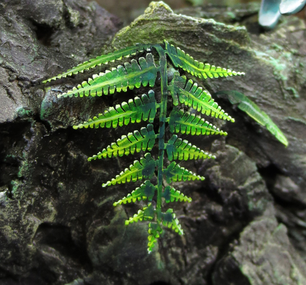
For lights, I use Green Gold (Golden) and Hearthfire (P3). I then add Ivory in this mixture and “voila”! Finally, in order to link plants to rocks, I add green filters near the areas where they are located. My rock thus gains a “forest” aspect, wet, tropical, which will marry pleasantly with the color of the tyranids. In the end, I get very bright ferns that provide saturation but remain integrated into the scene and future protagonists.
The base being finished and the deadline approaching, it is time to move to these precisely.
![]() FR :
FR :
Pour la peinture des fougères je me suis donc servi de la couleur du papier comme base. Avec un vert (Chromium Oxyde Green, Golden) et du noir, j’ai d’abord commencé par peindre le dessous des plantes. Ensuite à l’aide de mon vert de base et d’une pointe d’encre turquoise j’ai commencé à ombrer les feuilles.
J’utilise un turquoise sombre pour cela. Pourquoi ? C’est tout simple. Les monstres ont du turquoise sur eux, aussi je continue à utiliser cette teinte à d’autres endroits. Cela reste subtil, mais fonctionnel. De plus, je gagne un aspect satiné/brillant dans les ombres et les intermédiaires ce qui contraste avec le sol bien plus mat.
Pour les lumières, j’use de Green Gold (Golden) et d’Hearthfire (P3). J’ajoute ensuite de l’Ivoire dans ce mélange et le tour est joué. Enfin afin de lier les plantes aux roches, j’ajoute des filtres verts près des zones où elles se situent. Ma roche gagne ainsi un aspect “forestier”, humide, tropical, qui va se marier agréablement avec la couleur des tyranides.
Au final, j’obtiens des fougères très vives qui apportent de la saturation mais qui restent intégrées à la scène et aux futurs protagonistes.
Le socle étant terminé et la date butoire se rapprochant, il est temps de passer à ceux-ci justement.
“Feel the movement”/”Sentir le mouvement…”
![]() UK :
UK :
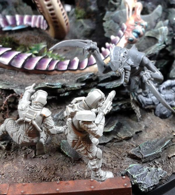
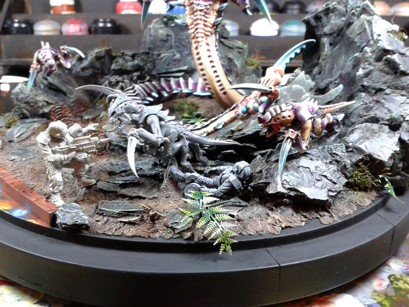
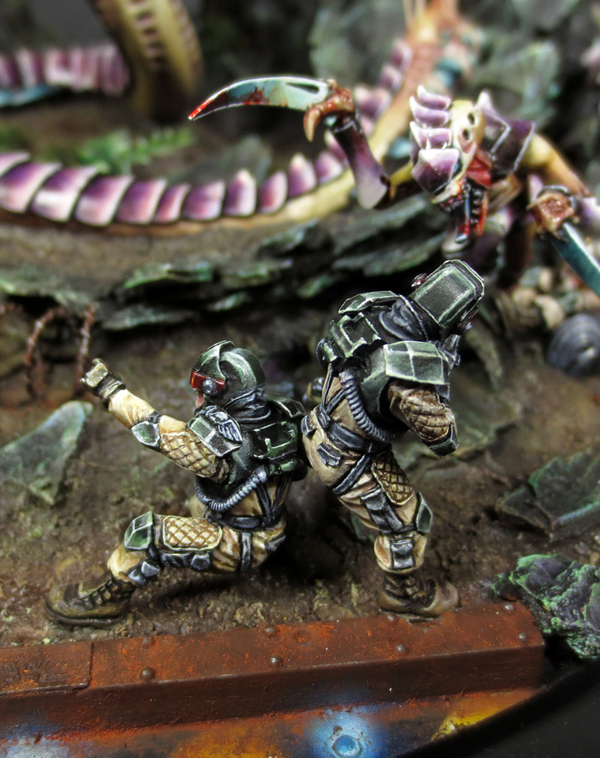
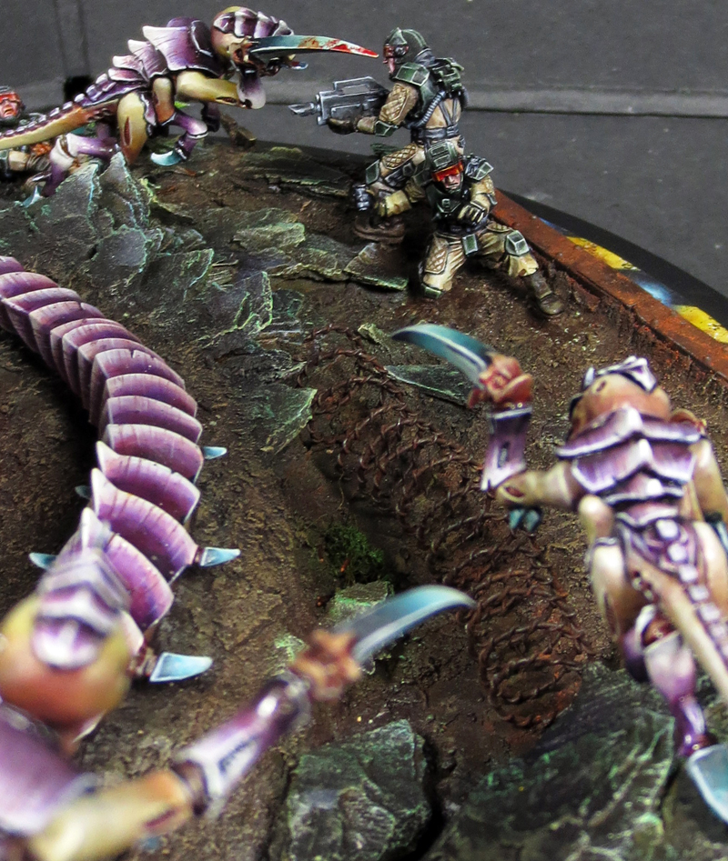
The purpose of this diorama is to feel the pressure of invading monsters, I play on the murderous and bestial aspect of the creatures. The arms of the tyranids are stretched forward, they seek to cut, kill. They are in contact with the opponents. Humans must not only be outnumbered on this small section of action, but also vulnerable. I make the decision to make one of them injured, or even a little more than that. On the ground, his belly open, his service is over. For the other two, they are close to each other. Like a last square. A Hormagaunt is a few inches from the one holding the rifle, the scene is frozen. We must leave it to the viewer to imagine the rest.
![]() FR :
FR :
Le but de ce diorama étant bien de faire sentir la pression des monstres envahisseurs, je joue sur l’aspect meurtrier et bestial des créatures. Les bras des tyranides sont tendus vers l’avant, ils cherchent à découper, tuer. Ils vont au contact des adversaires. Les humains doivent être non seulement en infériorité numérique sur cette petite section d’action, mais aussi vulnérables. Je prends la décision de faire de l’un des leurs un blessé, voire même un peu plus que cela. Au sol, le ventre ouvert, son service est terminé. Pour les deux autres, ils sont proches l’un de l’autre. Comme un dernier carré. Un Hormagaunt est à quelques centimètres de celui qui tient le fusil, la scène est figée. Il faut laisser au spectateur le soin d’imaginer la suite.
![]() UK :
UK :
For the Elysians and always in order to save time, the base of the fabric is made with an airbrush.
I use again the light color mostly used on the base and tyranids: Ivory + Naples Yellow.
I keep a coherent whole, I harmonize the whole while keeping a reduced palette. This is very important on pieces of this size.
![]() FR :
FR :
Pour les Elyséens et toujours afin de gagner du temps, la base du tissu est réalisée à l’aérographe.
Je réutilise la teinte d’éclairci majoritairement utilisée sur le socle et les tyranides : Ivoire + Jaune de Naples.
Je garde un tout cohérent, j’harmonise l’ensemble en gardant une palette réduite. C’est très important sur des pièces de cette taille.
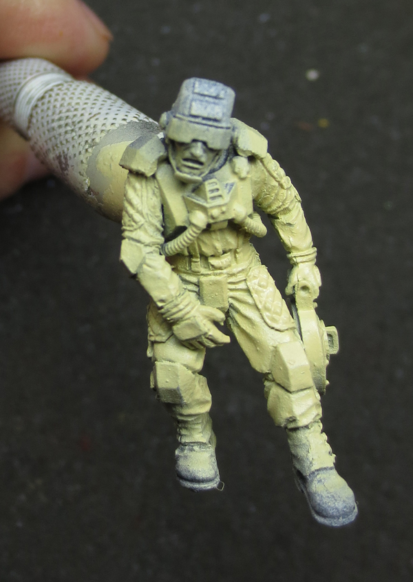
![]() UK :
UK :
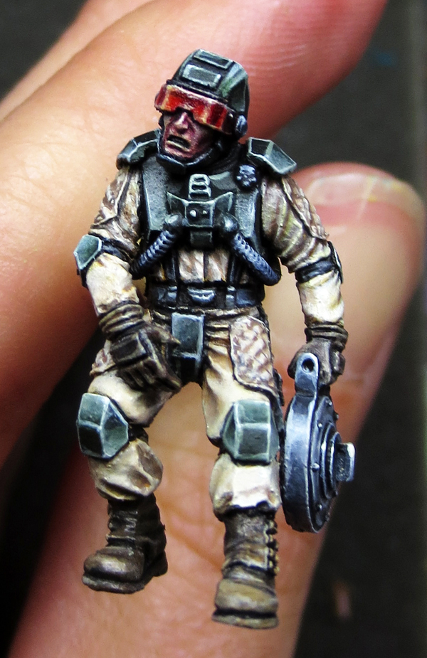
I remained mostly and willingly close to the official color scheme. The only small “gap” being that I led the black armor rather to a black / green.
For this one, I base the armor with a mixture of green (Chromium Oxide Green) and black. The ratio is globally 30/70. I then come directly to put, in successive wash, green highlight. I gradually increase this tint with Ivory, without getting to pure Ivory.
For the fabric, I start with the shadows. The trick is to not go too opaque on it, just to not to lose the basic light base. I shade delicately with well diluted juices. I put the juice of a neutral brown, like the old Graveyard Earth (GW), then I darken the tone with Umbral Umber (P3) + Chromium Green Oxide. Green mixed with brown allows me to harmonize the tones of the fabric with the armor. Reminders, always reminders. The lights are mounted with pure Ivory.
In the end, I find myself with tyranids in warm tones (purplish red) and imperial guards in cold tones (green armor, reminder of green). I build between the protagonists a hot/cold contrast but also a contrast of complementarity (red/green).
![]() FR :
FR :
Je suis resté majoritairement et volontairement proche du schéma de couleur officiel. Le seul petit “écart” étant que j’ai conduit le noir de l’armure plutôt vers un noir/vert.
Pour celui-ci, je base l’armure avec un mélange de vert (Chromium Oxyde Green) et de noir. Le ratio est globalement 30/70. Je viens ensuite directement poser, en lavis successifs, des éclaircis verts. Je monte progressivement cette teinte avec de l’Ivoire, sans pour autant arriver à celle-ci pure.
Pour le tissu, je commence par faire les ombres. Le tout est de ne pas y aller trop en opacité pour ne pas perdre la teinte claire de base. J’ombre délicatement avec des jus bien dilués. Je pose des jus d’un marron neutre type ancien Graveyard Earth (GW), puis je fonce le ton avec de l’Umbral Umber (P3) + Chromium Oxyde Green. Le vert mélangé au marron me permet d’harmoniser les tons du tissu avec l’armure. Les rappels, toujours les rappels. Les lumières sont montées avec de l’Ivoire pur.
Au final, je me retrouve avec des tyranides aux tons chauds (rouges violacés) et des gardes impériaux aux tons froids (armure verte, rappel de vert). Je gagne entre les protagonistes un contraste chaud/froid mais aussi un contraste de complémentarité (rouge/vert).
![]() UK :
UK :
Regarding the narrative aspect, one of the Elysian yos is fatally wounded. To reach the length and make this sensation, it was necessary to trick when gluing the arms and legs by cutting the resin to obtain the desired pose. The blood is made using Tamiya X-27.
![]() FR :
FR :
Concernant l’aspect narratif, un des Elyséens est mortellement blessé. Pour parvenir à l’allonger et rendre cette sensation, il a fallut ruser lors du collage des bras et des jambes en coupant la résine pour obtenir la pose désirée. Le sang est réalisé à l’aide de Tamiya X-27.
![]() UK :
UK :
Here are some pictures to realize that in addition to the pose of figurines giving the impression of movement, it is important that the looks of the figurines cross well and well. To give the feeling of action, life, realism.
![]() FR :
FR :
Voici quelques angles de vues permettant de se rendre compte qu’en plus de la pose des figurines donnant l’impression de mouvement, il est important que les regards des figurines se croisent bel et bien. Pour donner la sensation d’action, de vie, de réalisme.
![]() UK :
UK :
Finally, after nearly 200 hours spread over three short weeks, the diorama was over. To be honest, i finished it the day of the contest at 5am, after a week where my general sleep time was around a few hours. For the whole week, yes … It will not have been for nothing, another Golden Demon in the backpack on the way back, and here are the final photos of a diorama that will have evolved enormously in each of its stages, in order to bring it to a satisfactory result.
![]() FR :
FR :
Enfin, au bout de près de 200h réparties sur trois petites semaines, le diorama était terminé.
Pour tout dire, il l’a été le jour du concours à 5h du matin, après une semaine où mon temps de sommeil général a du avoisiner une petite dizaine d’heures. Pour la semaine entière, oui…
Cela n’aura pas été pour rien, une statuette de plus dans le sac à dos au retour, et voici les photos finales d’un diorama qui aura énormément évolué à chacune de ses étapes, afin de le faire aboutir au résultat satisfaisant.
The Greatest Enemy


