

UK TEXT :
I started this miniature during a Masterclass in Lyon. During the class, differents subjects were saw, like the painting of the clothes, the face/skin, eyes, the mask, weathering, and a lot about color and lighting theories, etc.
I’ll come back on some points, and of course, will develop the rest.
———————–
TEXTE FR :
Cette figurine a été débutée lors d’un Masterclass à Lyon. Durant ce cours, différents sujets ont été abordés, comme la peinture du tissu, le visage/la peau, les yeux, le masque, le weathering, et aussi beaucoup de théories sur la lumière, les couleurs, etc.
Je vais revenir sur certains points, et bien évidemment, développer le reste.
Let’s start !
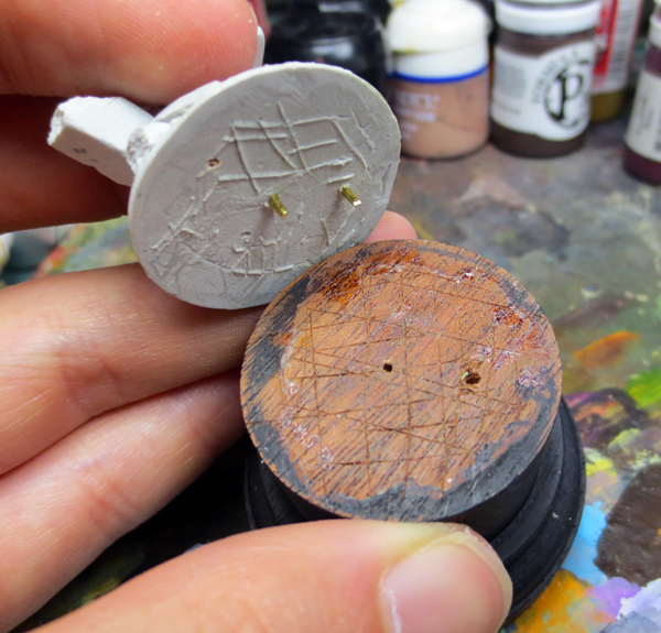
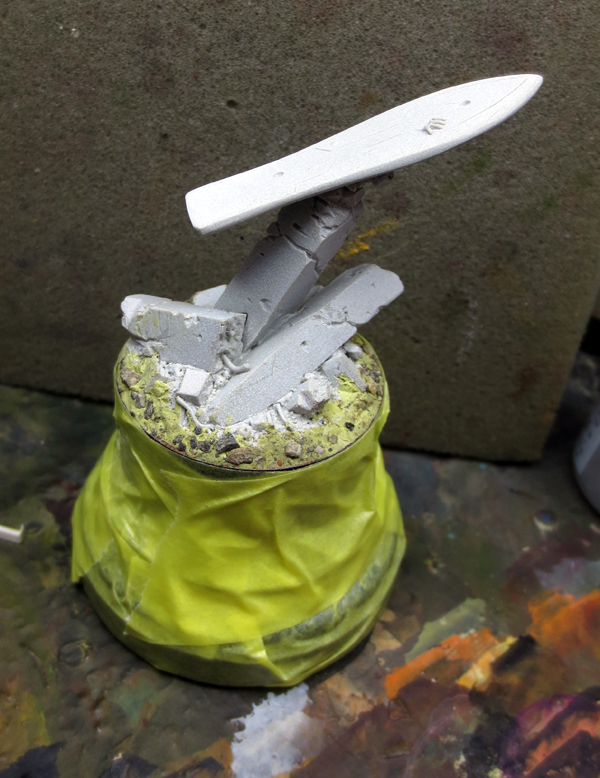
UK : First thing to make sure that the base joins perfectly with the wooden one, is to lacerate both and create recesses for the glue. Gluing will be much stronger with this technique, instead of gluing plane surfaces together.
Also, don’t forget the pins.
———————–
FR : Première chose à faire pour s’assurer que le socle adhérera parfaitement à celui en bois, c’est de les lacérer pour créer des renfoncements. La glue se nichera dans ces derniers, et créera une adhérence bien plus forte qu’entre deux surfaces uniquement lisses.
Ne pas oublier de tiger.
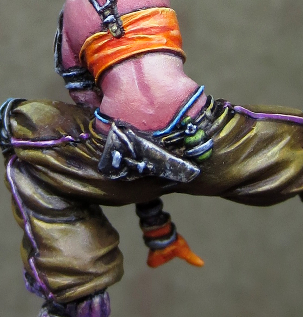
UK : The pants were based with a 50/50 mix of Umbral Umber P3 and Snakebite Leather (GW).
Lights with base + Naples Yellow. To Naples Yellow + Ivory.
Shadowing was done with the base + Umbral Umber, to this color pure.
Then I added some black, Ultramarine blue (not the GW, the “art” color), and purple (Liche Purple GW).
At first i was thinking of doing the shirt in blue/turquoise (as the kneepads) to get a color contrast with the mask. But during the class, I realized that orange was a better choice in terms of readability.
So I started to base it. The base is a mix of GW blazing orange and Cadmium Orange (Liquitex).
———————–
FR : Le pantalon a été basé avec un mélange 50/50 d’Umbral Umber P3 et de Snakebite Leather (GW)
Les lumières sont issues d’un mélange de la base + du jaune de Naples (Lefranc Bourgeois). Jusqu’au jaune de Naples + Ivoire (PA)
Les ombres ont été réalisées avec la base + de l’Umbral Umber, jusqu’à cette teinte pure. Puis y a été adjoint une pointe de noir, un peu de Bleu Outremer (Lefranc Bourgeois) et du violet (Liche Purple GW).
Au début j’avais pensé faire le T-shirt en bleu/turquoise (comme les genouillères) pour obtenir un contraste de couleur avec le masque. Mais j’ai réalisé pendant le cours que le orange serait bien mieux. Question de lisibilité.
J’avais donc commencé à le baser. La base est un mélange de Blazing Orange GW et d’Orange de Cadmium (Liquitex).
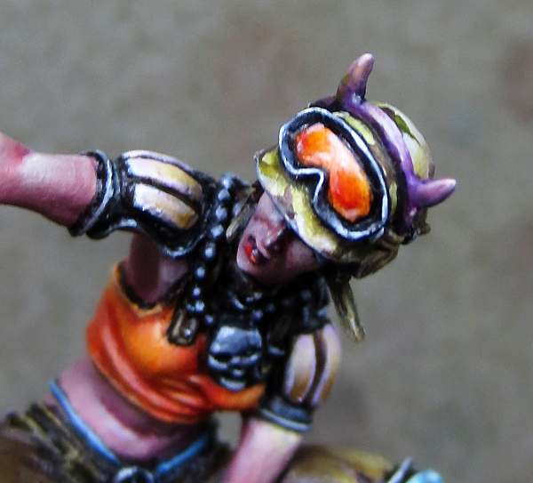
UK : Painting the face was the occasion to show the key points concerning highlight :
- Front (here not visible with the helmet),
- Chin
- Nostrils,
- Nose
- Cheekbones,
- Lower lip
- Recess of the eyes.
———————–
FR : La peinture du visage a été l’occasion de noter les points importants à éclaircir :
- Front (non visible ici avec le casque),
- Menton,
- Narines,
- Nez,
- Pommettes,
- Lèvre inférieure
- Creux des yeux.
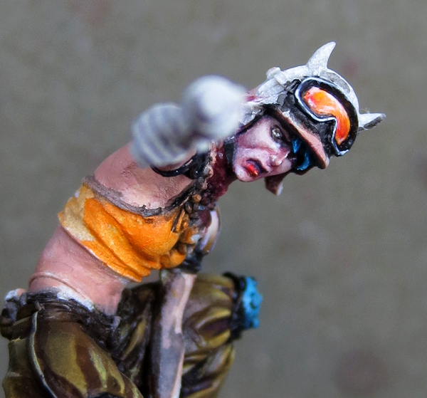
The helmet/Le casque
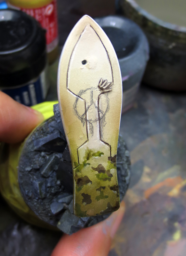
UK : For the helmet, I decided to make a military/camo pattern. I based it with a cream tone, then I added irregular spots of dark brown (Umbral Umber P3), and green (Olive Ordic P3)
The pattern is finished by painting some spots with Ivory.
———————–
FR : Pour le casque, j’ai décidé de faire une sorte de camouflage/camo. J’ai basé le tout avec un ton crème, puis j’ai réalisé des tâches irrégulières de marron foncé (Umbral Umber P3) et de vert (Olive Ordic P3).
J’ai terminé en soulignant ou en peignant certaines zones avec de l’Ivoire.

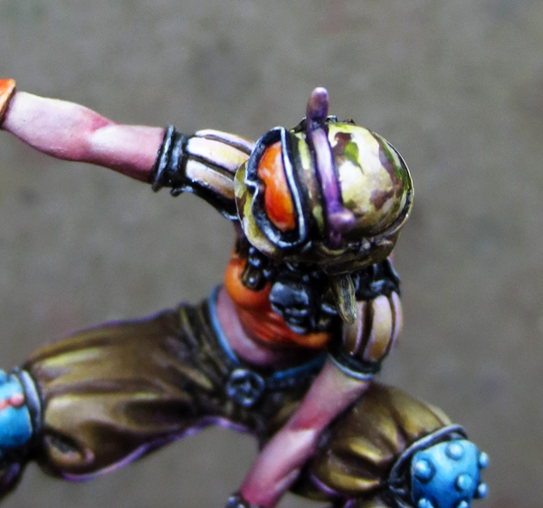
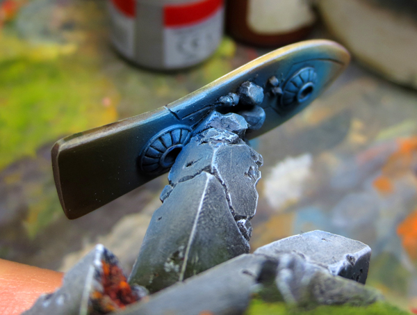
UK : About the painting of the visor, the point was to simulate the reflection of the light on this kind of form and material.
The shape is curved and highly reflective (plastic). So the point of light has to be really bright but also centered and extended.
Also, it’s important to play on contrast, by having rich and deep shadows (here Scab red GW).
I finished with a very thin coat of glossy varnish. It has to be very thin, or you’ll lose the effect and placement of your points of light.
———————–
FR : Concernant la peinture de la visière, il a s’agit de simuler la réflexion de la lumière sur ce genre de forme et de matériel.
La forme est incurvée est très réfléchissante (plastique). Le point de lumière se doit donc d’être vif, mais aussi centré et étendu.
Il est aussi important de jouer sur le contraste, en ayant des ombres riches et profondes (ici le Scab Red GW).
J’ai terminé avec une passe très fine de vernis brillant. Il faut que la passe soit très fine, ou vous perdrez l’effet et le placement de vos points de lumière.
The skin/La peau
UK : The skin was made to suggest a simple “caucasian” tone.
Base with Tallarn Flesh GW + Sanguine Base P3.
The lights are done with more Tallarn flesh, until arrived to pure Tallarn. Then I added some Ivory and Naples Yellow. Final points of light are done with pure Ivory.
Don’t forget that the more you’re going into the light, the less you have to dilute. To keep the opacity and the impact of your lights.
Shadows are done with Sanguine Base, again, until arrived to a pure tone.
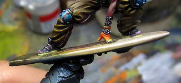
The important thing here, was to place the light correctly, according to the pose of the miniature. As she leans on her overboard, it’s important to have in mind the angle of the light coming from the top, when the mini is on the board, especially for the arm. Without taking care of that, it’s easy to miss the step.
———————–
FR : La peau a été traitée dans des tons caucasiens.
La base est en Tallarn Flesh GW + Sanguine Base P3.
Les lumières sont poussées en ajoutant de plus en plus de Tallarn, jusqu’à cette teinte pure. J’y ajoute ensuite de l’Ivoire et du jaune de Naples. Les points de lumière sont en Ivoire pur.
N’oubliez pas que plus vous allez dans les lumières, moins vous devez diluer. Il faut conserver l’opacité et l’impact de vos lumières.
Les ombres sont en Sanguine Base, encore une fois, jusqu’à parvenir à cette teinte pure.
Le plus important ici est de bien placer ses lumières, en accord avec la pose de la figurine. Elle est en effet penchée sur son overboard, et il est primordial de garder en tête l’angle de la source de lumière. Surtout quand la figurine est sur sa planche, et notamment pour le bras. En ne tenant pas compte de cela, il est facile de se tromper.
End of cloths + details/Fin des habits + détails
UK : I finished the pants by adding purple to the lines on the sides. All is simply based with Lich Purple. Highlights are first done with a medium Magenta (Liquitex) and then Ivory.
The watches are painted in tones of grey. Just take care of having nice contrasts and points of light to simulate a sort of metal, or reflective material.
———————–
FR : J’ai terminé le pantalon en ajoutant du violet sur les lignes des côtés. Le tout est simplement basé en Liche Purple. Les lumières sont d’abord entamées avec du Magenta médium (Liquitex) puis de l’Ivoire.
Les montres sont peintes en tons de gris. Il faut juste prendre soin d’avoir de bons contrastes et points de lumières afin de simuler un genre de métal, ou de matière réfléchissante.
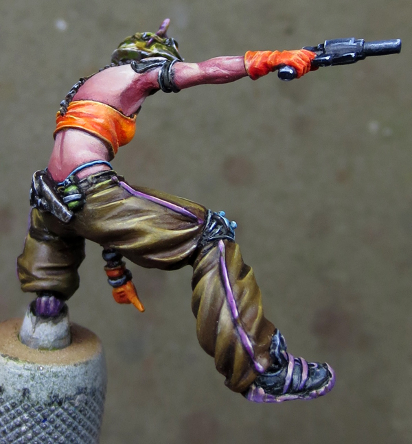
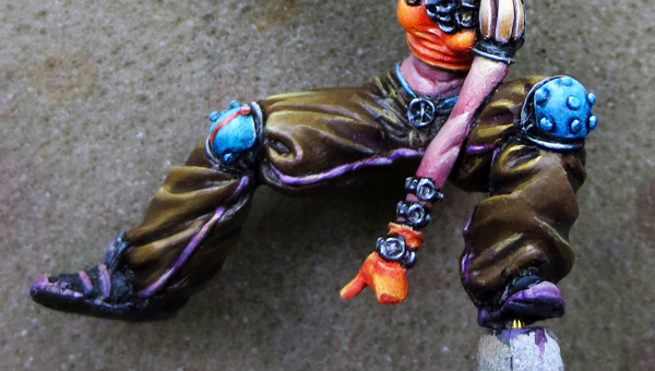
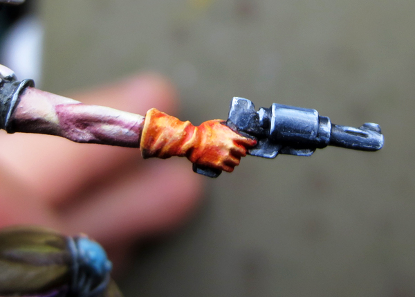
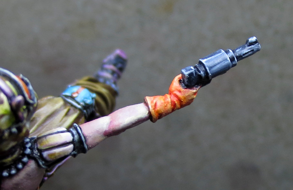
UK : Concerning the shirt, as I wrote before, the base was a mix of Blazing orange from GW, and Cadmium Orange (Liquitex).
I started to make some shadow by adding Scab red to my base. The final shadow was somewhere a mix of Scab red and Blazing Orange, maybe at 60/40. But never pure red. It has to remain an orange tone.
Lights are done with the base + Naples yellow, to pure Naples yellow. Then I added a point of Ivory in the yellow for the final points of light.
———————–
FR : Concernant le t-shirt, comme écrit plus tôt, la base est un mélange de Blazing Orange de GW, et d’Orange de Cadmimum (Liquitex).
J’ai commencé par marquer les ombres en ajoutant du Scab Red dans ma base. Les ombres finales ont été une sorte de mélange entre le Scab Red et le Blazing Orange, sans doute un ratio 60/40. Il faut surtout que ça reste un ton d’orange et non pas un rouge.
Les lumières sont réalisées avec la base + du jaune de Naples, jusqu’au jaune de Naples pur. J’ajoute ensuite une pointe d’Ivoire dans le jaune pour les derniers points de lumière.

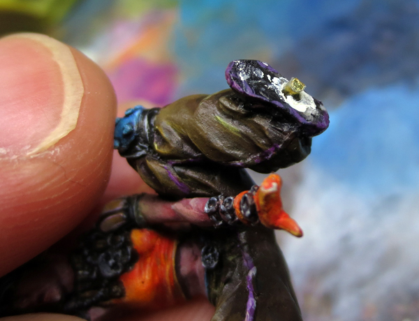
UK : The holster received a little texture, like a used dark leather.
The pantie’s strings are painted in turquoise, just because of color theory. Orange and turquoise are opposite on the color wheel.
———————–
FR : L’étui du pistolet reçoit une petite texture, façon cuir foncé usagé.
Les ficelles du string sont peintes en turquoise, question de théorie des couleurs. L’orange-rouge et le turquoise étant opposés sur la roue chromatique.
The gun/Le pistolet
UK : For the gun, the goal was to make a simple NMM/reflective effect. Clear and dark lines were made to simulate metal.
The thing is to link clear and dark tones, like “clear/dark/clear/dark/clear” and so on… Of course the form of the object and his placement will determine at first where the light will be placed.
References are, of course, a great help.
———————–
FR : Pour l’arme, le but a été de faire un simple effet de NMM. Les lignes claires et sombres doivent nous aider à simuler le métal.
Le truc est d’enchaîner les tons clairs et sombres, genre “zone claire, zone foncée, zone claire, zone foncée” etc… Bien évidemment, la forme de l’objet et son positionnement détermineront où la lumière se posera.
Les références sont bien sûr, d’une aide certaine.

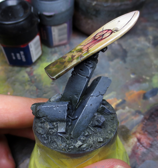
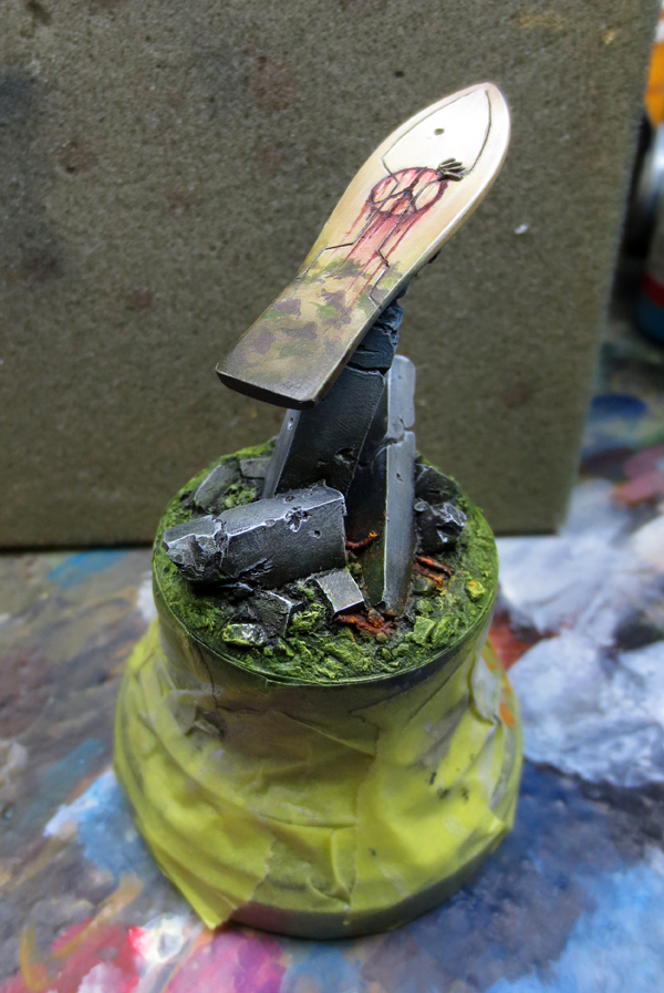
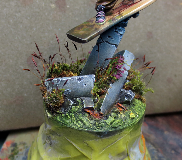
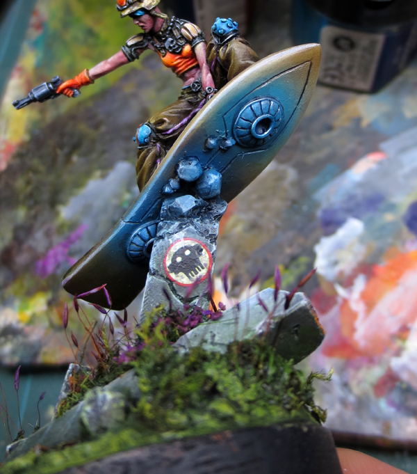
The Overboard
UK : The overboard and the pillars of the base were glued. I also added some pebbles and milliput to make the kit perfectly fits my display base.
Masking tape is used to protect the wooden base.
———————–
FR : L’overboard et les piliers sont collés. J’ai aussi ajouté des petits cailloux et du milliput pour que le kit s’intègre parfaitement avec le socle de présentation.
Du scotch de masquage est utilisé pour le protéger.
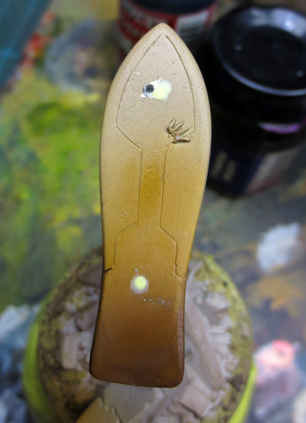
UK : I first airbrushed some colors to the board. I chose Kommando Khaki GW for the base, and started shadows with a mix of Snakebite Leather and Graveyeard Earth GW. Then I used Umbral Umber.
Lights were pushed with Ivory.
I then resealed the mounting holes provided. Again with the use of milliput. I drilled another one.
———————–
FR : J’ai commencé par “aérographier” quelques couleurs sur la planche. J’ai choisi du Kommando Khaki GW pour la base, puis aie commencé les ombres avec un mélange de Snakebite Leather et de Graveyard Earth GW. J’ai ensuite utilisé de l’Umbral Umber. Les lumières sont montées à l’Ivoire.
J’ai ensuite rebouché les trous de fixations prévus. Cette fois encore avec du milliput. J’en ai foré un autre.

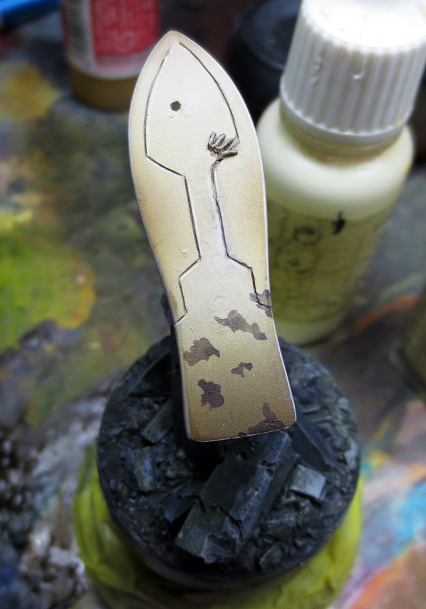
UK : I started to refine the board with normal brushs. Then I began the camo design. Again by making irregular dark spots.
It’s also important to play witht the opacity/dilution in a single spot. I did the same with green, and then I applied a very diluted green wash, followed by a dark brown one.
With a pencil I drew the “peace&love”symbol (on the picture the central line was not finished).
———————–
FR : J’ai affiné la planche avec les pinceaux. Puis j’ai commencé le camouflage sur le bas. Cette fois aussi, en faisant des tâches irrégulières.
Il est aussi important de jouer sur l’opacité et la dilution dans une seule et même tâche. J’ai fait de même avec du vert, puis j’ai appliqué un jus très dilué de cette couleur, suivi par un jus de marron foncé.
Avec un crayon, j’ai dessiné le symbole “peace&love” (sur la photo, la ligne centrale n’est pas terminée).
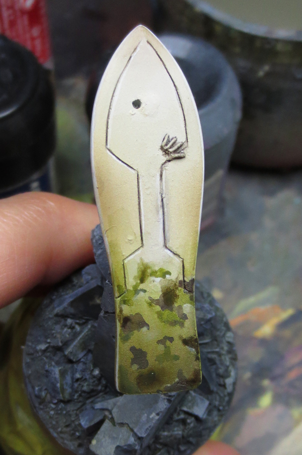
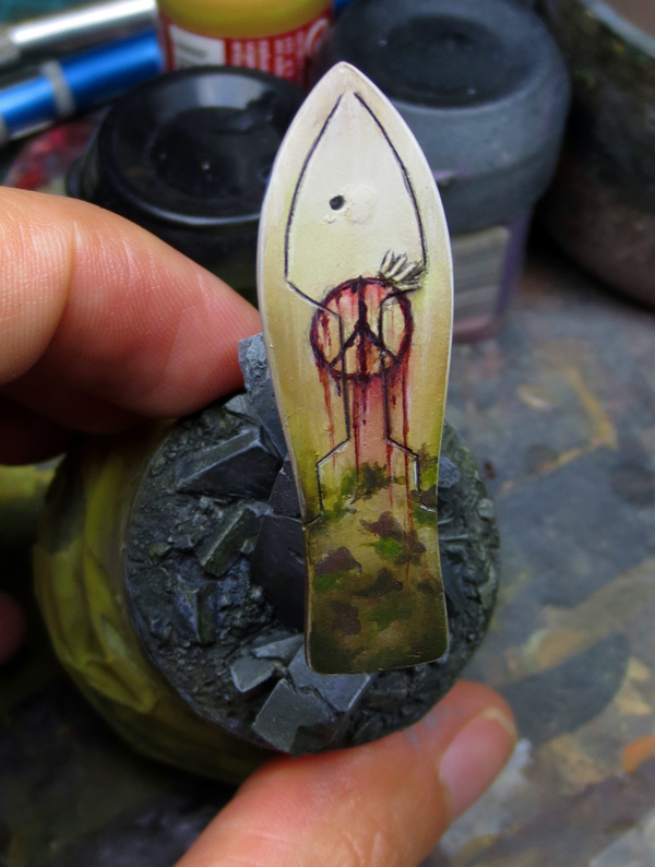
UK : The symbol was then painted with a red mix (blood and scab red), and finished with X-27 Clear red from Tamiya, to have a really bloody and glossy effect.
I let you have fun with the meaning of the bloody “peace&love” coexisting with a military camo.
———————–
FR : Le symbole a été peint avec un mélange de rouge (blood et scab red) et terminé avec du Tamiya Clear Red X-27, afin d’obtenir un effet brillant et sanglant.
Je vous laisse vous amuser sur la signification du “peace&love” ensanglanté accolé au camo militaire.
The base/Le socle
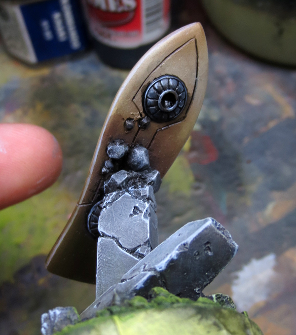
UK : The pilars received a dark blue/grey basecoat (Codex Grey, dark blue and black).
The ground received a green base with Olive Ordic P3.
———————–
FR : Les piliers reçoivent une base de gris/bleu foncé (Codex grey, bleu sombre et noir).
Le sol reçoit une base d’Olive Ordic P3.

UK : The antigravity system is painted in grey + black, shadowed with black, and lightened with a medium grey.
Then I placed an OSL effect with my airbrush. I only used turquoise and nothing else.
———————–
FR : Le système anti-gravité est peint en gris + noir, ombré en noir, et éclairci avec un gris moyen.
Je place ensuite un petit OSL avec mon aérographe. Il n’a été employé que du turquoise et rien d’autre.
UK : I continue to work on the pillars and ground. I put more contrast on the pillars by shadowing and lightening them (dark grey tones, + dark greens tones, and medium grey, clear grey, and Ivory).
For the ground, it was important to gain in saturation, by using more vibrant greens (by mixing different yellows like Heartfire and Cygnus Yellow from P3 into the Olive Ordic).
A pin was inserted in the left foot of Lisbeth. I then glued the miniature on the overboard, and used milliput to make the joins between the feet/board and the arm/fingers on the board. I paint directly over the dry milliput afterward.
———————–
FR : Je continue le travail sur les piliers et le sol. Je rajoute des contrastes sur les piliers, en les ombrant et les éclaircissant (tons de gris foncés + tons de verts foncés, gris médium, gris clair, et Ivoire).
Pour le sol, il fallait surtout rajouter de la saturation. En utilisant des tons plus vifs de verts (j’ai donc rajouté différents jaunes comme l’Heartfire et le Cygnus Yellow de P3, le tout mélangé à l’Olive Ordic).
Une tige est insérée dans le pied gauche de Lisbeth. Je la colle sur l’overboard, et utilise du milliput pour réaliser les joints entre les pieds/la planche et le bras/les doigts. J’ai peins directement sur le milliput sec par la suite.
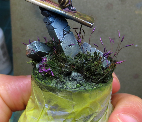
UK : I added some grass and vegetation on the ground. I used superglue to maintain them. Just don’t forget that any vegetation you add (synthetic or natural) has to be fully repaint. From A to Z. You cannot use stuff like that without repainting it. It’ll not look good beside your painting miniature. The difference between non-painted and painted object will be too important at this scale to not be seen.
For the painting, I first use very dark green for the grass, and some purple for every flowers. Just to have a color recall, and because the purple of the flower will respond to every bright tones and yellow lights used in the miniature (in the flesh, the helmet, the orange etc.). The yellow will be on top in terms of composition, and the purple on the ground, like on the color wheel (yellow on top, purple down). Color work, again and again, this has to be taken in consideration until final details.
———————–
FR : J’ai ajouté un peu d’herbe et de végétations sur le sol. J’use de superglue pour fixer le tout. Point important, il ne faut surtout pas oublier que toute végétation que vous ajoutez (synthétique ou naturelle) doit systématiquement être repeinte. De A à Z. Vous ne pouvez pas utilisez ce genre de produits sans les repeindre. Cela jurera trop avec votre figurine. La différence entre les éléments non-peints, et ceux peints, étant trop importante à cette échelle pour passer inaperçue.
Pour la peinture, je commence à rajouter des tons de verts très sombres dans l’herbe, et du violet sur chaque “fleur”. Cela afin d’avoir un rappel de couleur, et car le violet des fleurs répondra de manière cohérente et efficace aux tons clairs et jaunes utilisés sur la figurine dans les lumières (dans la peau, le casque, l’orange etc.). Le jaune sera en haut en terme de composition, et le violet sur le sol, comme sur une roue chromatique (le jaune en haut, le violet en bas). La travail des couleurs, encore et encore, il faut la prendre en considération jusque dans les infimes détails.
UK : I finalised the OSL and the antigravity device by adding some contrasts and definition. I also added a little “Alien/Robot watch out” symbol. It helps to install a climate of coherence and history in the piece. With that you clearly think about the opponent that Lisbeth may be fighting. I also made a little graffiti “JC 14″. I volountary made it very “childish” in terms of design and erased by the time and the weather. I did the same for the pillar, by making a bit of weathering, just to create a feeling that this zone is pretty abandoned, like a “no-man’s land”, the overall feeling consolidated by the “watch out : Alien/Robot” symbol.
A miniature is not only a painting routine, you have to tell a story.
The grass is simply hightlighted with clear yellow/green (not too far in the yellow, it must remains darker than the miniature), and the flower with purple + Ivory.
———————–
FR : J’ai finalisé l’OSL et le système anti-gravité en rajoutant des contrastes et de la définition. J’ai aussi rajouté un petit symbole “Attention Alien/Robot ici”. Cela aide à installer un climat de cohérence et une histoire à la pièce. Avec cela, on pense tout de suite à l’opposant de Lisbeth qu’elle est sans doute en train de combattre. J’ai aussi fait un petit graffiti “JC 14″. Je l’ai volontairement réalisé dans un style “enfantin” en terme de design et surtout l’ai rendu effacé par le temps et la météo. J’en ai fait de même avec les piliers, avec un peu de weathering, juste pour créér un sentiment de zone abandonnée, comme un “no man’s land”, l’impression étant renforcée et consolidée par le symbole “Attention : Alien/Robot”.
Une figurine ce n’est pas qu’une routine de peinture, il faut aussi penser à lui faire raconter une histoire.
L’herbe est terminée avec des éclaircis de jaune/vert (ne pas aller trop loin dans le jaune, il faut qu’il reste plus sombre que la figurine), et les fleurs avec du violet + Ivoire.

FINISH/TERMINÉ !
UK : To conclude this article, I can only send you to an article I wrote about contrasts, that is a good supplement to this step by step.
And now the final pictures !
———————–
FR : Pour conclure cet article, je ne peux que vous renvoyer vers un autre article que j’ai écris, concernant les contrastes. Il sera en effet un bon supplément à ce pas à pas.
Et maintenant les photos finales !
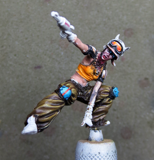
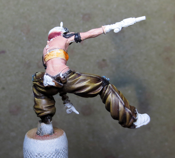
LISBETH
")
")
")
")
")
")
")
")
")
")
")
")
")
")
")
")
")
")
")
